
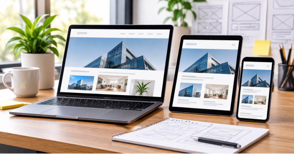
Today, people visit websites using smartphones, tablets, laptops, and desktops. If your website does not adjust to different screen sizes, visitors may struggle to read content, navigate pages, or complete actions.
Responsive web design helps solve this problem by adapting a website’s layout and content to different screen sizes. It creates a consistent browsing experience while making your website easier to use and manage.
In this guide, we’ll explore the key benefits of responsive web design and practical best practices for creating a mobile-friendly website.
What Is Responsive Web Design?
Responsive web design is an approach to website development that allows pages to automatically adjust to the screen size and device being used.
Instead of creating separate websites for mobile and desktop users, responsive websites use flexible layouts, CSS media queries, and adaptable images to maintain usability across devices.
For example, a three-column desktop layout may change into a single-column layout on a smartphone, making the content easier to read.
Key Benefits of Responsive Web Design
1. Better User Experience
Responsive layouts make content easier to read and interact with on different devices. Visitors can browse pages, access information, and use website features without unnecessary zooming or horizontal scrolling.
2. Improved Mobile SEO
Google primarily uses the mobile version of website content for indexing. A responsive design helps maintain consistent content across devices and supports a mobile-friendly website structure.
Learn more about Google’s mobile-first indexing guidance.
3. Reduced Mobile Abandonment
Difficult navigation, unreadable text, and poorly displayed buttons can frustrate visitors. Responsive design addresses these usability issues, helping visitors continue browsing instead of leaving because the website is difficult to use.
4. Better Conversion Opportunities
When contact forms, service information, and call-to-action buttons work properly on mobile devices, visitors can more easily contact your business, request a quote, or explore your services.
5. Consistent Brand Experience
A responsive website maintains a consistent visual identity across devices. This helps businesses present their brand, messaging, and services professionally, regardless of screen size.
10 Best Practices for Responsive Web Design
1. Start with a Mobile-First Approach
Design the mobile version of your website first. Focus on essential content, simple navigation, and important actions before expanding the layout for larger screens.
2. Use Flexible Layouts
Use CSS Grid, Flexbox, percentages, and relative units to create layouts that adapt to available screen space instead of relying entirely on fixed-width elements.
3. Optimize Images
Use appropriately sized images and modern formats such as WebP where suitable. Make sure images resize correctly without stretching or slowing down the page.
4. Maintain Readable Typography
Choose readable font sizes, appropriate line spacing, and sufficient contrast. Text should remain comfortable to read without requiring users to zoom in.
5. Simplify Navigation
Keep menus clear and easy to use. On smaller screens, use mobile-friendly navigation that allows visitors to find important pages quickly.
6. Choose Content-Based Breakpoints
Use CSS media queries to adjust layouts when the content needs more space, rather than relying only on fixed device widths such as 320px, 768px, or 1024px.
For example:
.service-grid { display: grid;
grid-template-columns: repeat(3, 1fr);
gap: 20px;
}
@media (max-width: 800px) {
.service-grid {
grid-template-columns: repeat(2, 1fr);
}
}
@media (max-width: 520px) {
.service-grid {
grid-template-columns: 1fr;
}
}
These values are examples. Choose breakpoints based on when your content or layout starts becoming difficult to use.
For more information, explore MDN’s responsive design guide.
7. Make Buttons and Forms Mobile-Friendly
Ensure buttons are easy to tap and forms are simple to complete. Avoid placing interactive elements too close together.
8. Improve Website Performance
Compress images, reduce unnecessary scripts, and optimize page loading. Monitor performance using Google PageSpeed Insights.
9. Follow Accessibility Practices
Use proper heading structures, descriptive links, sufficient color contrast, and accessible form labels. These improvements help more people interact with your website.
10. Test Across Different Devices
Check your website on smartphones, tablets, and desktops. Test navigation, images, forms, buttons, and page layouts to identify display or usability issues.
Responsive vs. Adaptive Web Design
Both approaches help websites work across different screen sizes, but they use different methods.
| Responsive Design | Adaptive Design |
| Uses flexible layouts that adjust to screen sizes. | Uses predefined layouts for selected screen sizes. |
| Adapts continuously to available space. | Switches between specific layout versions. |
| Often easier to maintain as one flexible layout. | May require managing multiple layout variations. |
The right approach depends on your website’s requirements, content, and development goals.
Common Responsive Design Mistakes to Avoid
- Using fixed-width layouts that cause horizontal scrolling.
- Adding images that are too large for mobile screens.
- Making text and buttons difficult to read or tap.
- Hiding important content on smaller devices.
- Ignoring website loading speed.
- Testing only on desktop screens.
Avoiding these mistakes helps create a more usable and consistent website experience.
How to Make Your Existing Website Responsive
If your current website does not work properly on mobile devices, consider these steps:
- Review the website on different screen sizes.
- Identify layout, navigation, and readability issues.
- Replace rigid layouts with flexible CSS.
- Optimize images and page performance.
- Improve buttons, forms, and mobile navigation.
- Test the updated website across devices.
A professional review can also help identify technical issues that may not be immediately visible.
Responsive Website Checklist
Before publishing your website, check that:
- Pages adjust to different screen sizes.
- Text is readable without zooming.
- Images resize correctly.
- Navigation works on mobile devices.
- Buttons and forms are easy to use.
- Pages load efficiently.
- Important content is available across devices.
- The website has been tested on multiple screen sizes.
Frequently Asked Questions
1. Why is responsive web design important?
It helps websites remain usable across smartphones, tablets, and desktops, improving accessibility and consistency.
2. Does responsive web design improve SEO?
Responsive design supports mobile usability and is recommended by Google. However, it does not guarantee higher rankings by itself.
3. Is responsive design suitable for every business website?
Yes. It is useful for business websites, service pages, portfolios, blogs, and e-commerce platforms.
4. What is the difference between responsive and mobile-friendly design?
Mobile-friendly describes a website that works well on mobile devices. Responsive design is a development approach that adjusts layouts to different screen sizes.
5. How can I test whether my website is responsive?
View your website at different screen sizes and test its navigation, images, forms, buttons, and content readability.
Conclusion
Responsive web design is essential for creating websites that work effectively across different devices. Flexible layouts, readable typography, optimized images, simple navigation, and proper testing help deliver a consistent user experience.
For businesses, investing in responsive design can make it easier for visitors to explore services and take meaningful actions.
At Amron Software, we focus on creating functional, user-friendly website experiences that support business goals. Explore our website design services to learn how we can help improve your website.
Ready to improve your website experience?