
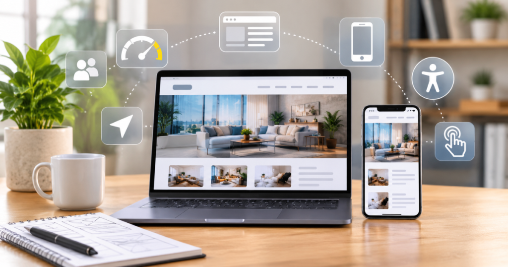
A website can offer excellent products or services and still lose potential customers if visitors find it difficult to use. Confusing navigation, slow-loading pages, unclear buttons, and poor mobile layouts can make people leave before they discover what a business offers.
This is why website design is about more than appearance. It shapes how visitors explore information, interact with features, understand your services, and decide what to do next.
A well-designed website user experience makes these actions feel simple and natural. It helps visitors find what they need without unnecessary effort while creating a positive impression of your business.
Let’s explore seven important ways website design affects user experience and what businesses can improve.
1. Clear Navigation Helps Visitors Find Information
Navigation is one of the first things visitors use to understand a website. If menus are confusing or important pages are difficult to locate, users may struggle to find the information they came for.
A clear navigation structure should use familiar labels, logical categories, and a consistent menu across the website.
For example:
- Poor experience: A service business places all its offerings under a menu labelled “More,” making visitors guess where to click.
- Better experience: The main menu clearly displays “Services,” “About Us,” “Projects,” and “Contact.”
The second layout gives visitors a clearer path and reduces unnecessary clicks.
What businesses can improve: Organize pages according to visitor needs, keep navigation labels straightforward, and make important pages easy to access.
2. Visual Hierarchy Makes Content Easier to Understand
Visual hierarchy determines how information is arranged and which elements attract attention first. It uses headings, font sizes, spacing, colours, and placement to guide visitors through a page.
Without a clear hierarchy, even useful information can become difficult to understand. Visitors may overlook important details or struggle to identify the next step.
For instance, a service page should make its main heading noticeable, explain the service with short sections, and place the relevant action where visitors can easily find it.
A strong visual hierarchy helps users:
- Identify the main message quickly.
- Scan headings and important information.
- Understand the relationship between different sections.
- Find relevant actions without searching through the entire page.
Keep layouts organized and avoid adding too many competing colours, fonts, or visual elements.
3. Responsive Design Improves the Mobile Experience
Visitors may access a website using smartphones, tablets, laptops, or desktop computers. If the layout works only on a desktop screen, mobile users may face unreadable text, overlapping sections, or difficult navigation.
Responsive web design adjusts the layout to different screen sizes, helping visitors use the website across devices.
Consider an online store where product details and the checkout button appear side by side on a desktop. On a mobile screen, these elements should rearrange into a readable layout with buttons that are easy to tap.
A mobile-friendly website should include:
- Readable text without unnecessary zooming.
- Images that fit the screen properly.
- Buttons and links with comfortable touch areas.
- Forms that are easy to complete on smaller screens.
- Navigation that works smoothly on mobile devices.
A consistent experience across devices helps visitors continue their journey without frustration.
4. Website Speed Keeps Visitors Engaged
Page speed directly affects how easily visitors can access website content. When pages take too long to load, users may leave before interacting with the website.
Large images, unnecessary scripts, excessive animations, and poorly optimized resources can contribute to slow performance.
Google’s Core Web Vitals provide measurable indicators of loading performance, interactivity, and visual stability. Businesses can use these metrics to identify performance issues and prioritize improvements.
For example: If a homepage displays its main heading but shifts the layout while images load, visitors may accidentally click the wrong link. Optimizing image dimensions and reserving space for visual elements can help reduce this problem.
Review your website using Google’s Core Web Vitals documentation and identify areas that need attention.
Is your website making visitors work harder than necessary?
Slow pages, confusing layouts, and difficult interactions can weaken the experience you offer. Review your website’s design and identify improvements that make it easier for visitors to explore your business.
Explore Amron Softech’s website design services to see how thoughtful design can support a more user-friendly digital experience.
5. Accessibility Makes Websites Easier to Use
Website accessibility helps people with different abilities access and interact with digital content. It also makes websites easier to navigate and understand for a wider range of visitors.
A website that depends only on colour, uses difficult-to-read text, or cannot be navigated using a keyboard may create barriers for some users.
Consider a form that marks an incorrect field only with a red border. A visitor who cannot easily distinguish the colour may miss the error. Adding a clear written error message makes the problem easier to identify.
Useful accessibility improvements include:
- Adding descriptive alternative text to meaningful images.
- Maintaining sufficient colour contrast.
- Using clear headings and descriptive links.
- Supporting keyboard navigation.
- Providing labels and instructions for form fields.
- Using readable fonts and consistent layouts.
Follow the W3C Web Accessibility Initiative’s accessibility principles when reviewing your website.
6. Clear Buttons and Forms Encourage Action
Calls to action (CTAs) guide visitors toward useful next steps, such as requesting a quote, booking a consultation, downloading a resource, or making a purchase.
A button that says “Submit” may not explain what happens next. A more specific label, such as “Request a Free Quote,” communicates the action more clearly.
Forms also influence user experience. Asking for unnecessary details can discourage visitors from completing an inquiry.
To make CTAs and forms more effective:
- Use action-oriented button text.
- Make important buttons easy to notice.
- Keep forms limited to essential information.
- Label each field clearly.
- Display helpful error messages.
- Provide confirmation after successful submission.
The goal is to make the next step obvious without overwhelming visitors with too many choices.
7. Consistent Design Builds Trust
A consistent website feels organized and professional. When colours, typography, button styles, spacing, and page layouts change unexpectedly, visitors may find the experience confusing.
Imagine a business website using one button style on its homepage and a completely different style on its service pages. This inconsistency can make the website feel unfinished.
A consistent design system helps create a recognizable experience across the website. It should include:
- A defined colour palette.
- Consistent typography.
- Reusable button and form styles.
- Similar spacing and layout patterns.
- Consistent visual treatment across important pages.
Consistency does not mean every page must look identical. Each page can serve a different purpose while maintaining the same overall design language.
How Can You Improve Website User Experience?
Improving website user experience starts with identifying where visitors face difficulty. Instead of changing the entire design without a clear reason, review the website’s usability and prioritize issues that affect important user journeys.
Here are practical steps businesses can take:
- Review your navigation: Check whether visitors can find important pages quickly.
- Simplify page layouts: Remove unnecessary elements and make important information easier to scan.
- Test mobile usability: Explore key pages and forms on different screen sizes.
- Improve loading performance: Optimize images and review unnecessary scripts or resources.
- Check accessibility: Review text contrast, image descriptions, keyboard access, and form labels.
- Strengthen calls to action: Make buttons clear, relevant, and easy to locate.
- Collect user feedback: Use website analytics, usability testing, and visitor feedback to identify recurring problems.
Small, evidence-based improvements can make important website journeys easier to complete.
What Is Included in a Website UX Audit?
A website UX audit evaluates how effectively a website supports visitors as they browse, understand information, and complete actions.
Use this checklist to review the most important areas:
- Navigation: Can visitors find key pages without confusion?
- Visual hierarchy: Are headings, content, and important actions clearly organized?
- Mobile usability: Does the website work properly on smartphones and tablets?
- Performance: Do pages load smoothly without disruptive layout shifts?
- Accessibility: Can visitors navigate and understand the content using different assistive methods?
- Forms: Are fields clearly labelled and easy to complete?
- Calls to action: Do buttons explain what visitors should do next?
- Consistency: Do pages follow a recognizable design system?
- User journeys: Can visitors complete important tasks without unnecessary steps?
An audit helps identify what is working, what needs improvement, and which changes should be prioritized.
For businesses planning broader digital improvements, Amron Softech’s design and technology solutions bring design, technology, and user-focused thinking together.
Frequently Asked Questions
1. How does website design affect user experience?
Website design affects how visitors navigate, read, and interact with a website. Clear layouts, responsive pages, readable content, and accessible features make it easier for users to find information and complete actions.
2. What are the most important elements of good website user experience?
The key elements include simple navigation, clear visual hierarchy, mobile responsiveness, fast loading, accessibility, consistent design, and understandable calls to action.
3. Can poor website design affect conversions?
Yes. Confusing navigation, unclear buttons, difficult forms, and slow pages can create friction in the customer journey. Improving these areas can make it easier for visitors to enquire, register, or purchase.
4. How can I check whether my website offers a good user experience?
Review important user journeys, test the website on different devices, check loading performance, evaluate accessibility, and collect feedback from actual visitors. A UX audit can help organize these findings.
5. How often should a website’s user experience be reviewed?
Review website performance and usability regularly, especially after major design changes, new feature launches, or changes in customer behaviour. Use analytics and visitor feedback to identify when further improvements are needed.
Create a Better Website Experience with Amron Softech
Your website should make it easy for visitors to understand your business, explore your services, and take the next step. Every design decision—from navigation and layout to mobile responsiveness and calls to action—contributes to that experience.
Amron Softech combines design and technology to create digital experiences that are visually engaging, intuitive, and aligned with business goals.
If your website needs a more user-friendly approach, connect with Amron Softech to discuss your requirements.